Introduction
Welcome back to our web development journey! Now that we've mastered the essentials of HTML, it's time to elevate our web pages with style. In this installment, we'll explore the world of Cascading Style Sheets (CSS) and learn how to bring visual appeal to our creations.
Understanding CSS
CSS is the language that adds style and layout to HTML documents. It allows us to control the colors, fonts, spacing, and overall presentation of our web pages. Let's delve into the key concepts of CSS.
Selectors and Declarations
CSS uses selectors to target HTML elements and declarations to define their styles. Learn the basics of selecting elements and setting properties like color, font-size, and margin.
Selectors:
Selectors are used to target specific HTML elements on which you want to apply styles. There are various types of selectors:
Element Selector:
Targets HTML elements by their tag name.
  p {
      /* styles for paragraphs */
  }
Class Selector:
Targets elements with a specific class attribute.
  .my-class {
      /* styles for elements with class "my-class" */
  }
ID Selector:
Targets a specific element with a unique ID attribute.
  #my-id {
      /* styles for the element with id "my-id" */
  }
Descendant Selector:
Targets an element that is a descendant of another specified element.
  article p {
      /* styles for paragraphs within an article */
  }
Child Selector:
Targets an element that is a direct child of another specified element.
        ul > li {
            /* styles for list items that are direct children of a ul */
        }
Properties and Values:
Once you have selected an element, you can set various properties to define its style. Here are some common properties:
Color:
Defines the text color.
color: #333; /* hex code, rgb, or color name */Font Size:
Defines the size of the text.
font-size: 16px; /* or other units like em or rem */Font Family:
Defines the font used for the text.
font-family: 'Arial', sans-serif;Margin:
Defines the space outside the element.
margin: 10px; /* or specify top, right, bottom, left individually */Padding:
Defines the space inside the element.
padding: 5px;Background Color:
Defines the background color of an element.
background-color: #f0f0f0;
These are just a few examples, and there are many more properties and values you can use to style HTML elements. It's essential to experiment and practice to become familiar with the different selectors and properties in CSS.
Box Model
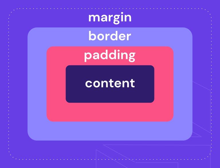
The CSS Box Model is a fundamental concept in web design and development. It defines the structure of an HTML element by breaking it down into several components: content, padding, border, and margin.
Components of the CSS Box Model:
Content:
The actual content of the element, such as text, images, or other HTML elements. It is surrounded by padding.
Padding:
The space between the content and the element's border. Padding helps create internal space within the element. It can be specified using the
paddingproperty.div { padding: 10px; /* Applies 10 pixels of padding on all sides */ }Border:
The border surrounds the padding and content, defining the outermost edge of the element. Borders can have different styles, widths, and colors. The
borderproperty is used to set the border.div { border: 1px solid #000; /* 1 pixel solid black border */ }You can also set individual border properties such as
border-width,border-style, andborder-colorfor more control.Margin:
The space outside the border, providing separation between this element and other elements in the layout. The
marginproperty is used to set margins.div { margin: 20px; /* Applies 20 pixels of margin on all sides */ }Like padding, you can set individual margin properties such as
margin-top,margin-right,margin-bottom, andmargin-left.
Visual Representation of the Box Model:

Box Model Calculation:
The total width and height of an element are calculated as follows:
Total width = Content width + (Padding × 2) + (Border width × 2) + (Margin × 2)
Total height = Content height + (Padding × 2) + (Border width × 2) + (Margin × 2)
Understanding the CSS Box Model is crucial for creating well-designed and responsive layouts on the web. It allows developers to control the spacing, sizing, and positioning of elements within a webpage.
Flexbox and Grid Layout
Flexbox and Grid are two powerful layout systems in CSS that enable developers to create responsive and complex layouts with ease.
Flexbox:
Flexbox is designed for one-dimensional layouts, either in a row or a column. It provides a flexible way to distribute space and align items within a container along a single axis (either horizontally or vertically).
Key concepts and properties:
Container Properties:
display: flex;ordisplay: inline-flex;turns an element into a flex container.flex-direction: row | row-reverse | column | column-reverse;determines the direction of the main axis.justify-content: flex-start | flex-end | center | space-between | space-around | space-evenly;aligns items along the main axis.align-items: stretch | flex-start | flex-end | center | baseline;aligns items along the cross axis.
Child Properties:
flex: flex-grow flex-shrink flex-basis;shorthand forflex-grow,flex-shrink, andflex-basisproperties.order: <integer>;changes the order of the flex items.align-self: auto | flex-start | flex-end | center | baseline | stretch;aligns a single flex item along the cross axis.
Flexbox is excellent for creating navigation menus, flexible card layouts, centering elements, and much more.
Grid:
CSS Grid Layout is a two-dimensional layout system that allows you to create grid-based designs, defining rows and columns to place elements in both directions.
Key concepts and properties:
Container Properties:
display: grid;creates a grid container.grid-template-rows: <track-size>...;defines the size of each row in the grid.grid-template-columns: <track-size>...;defines the size of each column in the grid.grid-gap: <row-gap> <column-gap>;creates gutters between grid rows and columns.
Child Properties:
grid-row: <start-line> / <end-line>;places an element on a specific row or range of rows.grid-column: <start-line> / <end-line>;places an element on a specific column or range of columns.grid-area: <row-start> / <column-start> / <row-end> / <column-end>;places an element within the grid by defining the grid area.
Grid is ideal for designing complex layouts, including full-page layouts, multi-column designs, and aligning elements with precision.
Choosing between Flexbox and Grid:
Use Flexbox when:
Dealing with one-dimensional layouts (rows or columns).
Creating navigation menus, flexible card layouts, or centering items along a single axis.
Use Grid when:
Working with two-dimensional layouts (rows and columns).
Designing complex layouts, like magazine-style layouts, full-page designs, or aligning items in a precise grid structure.
By understanding and utilizing these layout techniques effectively, developers gain powerful tools to create versatile, responsive, and visually appealing layouts for modern web applications.
Responsive Design
Making web pages responsive is a crucial aspect of web design, ensuring that the layout and styles adapt to different screen sizes and devices. Media queries in CSS allow you to apply specific styles based on the characteristics of the device. Here's a basic guide on using media queries for responsiveness:
Basic Media Query Structure:
/* Styles for all devices */
body {
    font-size: 16px;
}
/* Media query for devices with a maximum width of 600px */
@media (max-width: 600px) {
    body {
        font-size: 14px; /* Adjust styles for smaller screens */
    }

    /* Additional styles specific to smaller screens */
    .header {
        display: none; /* Hide header on smaller screens */
        }
    .menu {
        width: 100%; /* Make the menu full-width on smaller screens */
    }
}
Key Concepts:
Syntax:
Media queries are wrapped in
@mediarule.Inside the parentheses, you define conditions using features like
width,height,orientation, etc.The styles inside the media query are applied when the condition is met.
Device Characteristics:
widthandheight: Specify the width or height of the viewport.min-widthandmax-width: Set minimum and maximum viewport width.orientation: Check if the device is in portrait or landscape mode.
Practical Examples:
/* Default styles for all devices */
body {
    font-size: 16px;
}

/* Media query for small screens (up to 768px) */
@media (max-width: 768px) {
    body {
        font-size: 14px;
    }
    .sidebar {
        display: none; /* Hide sidebar on small screens */
    }
}

/* Media query for medium screens (769px to 1024px) */
@media (min-width: 769px) and (max-width: 1024px) {
    .main-content {
        width: 70%; /* Adjust main content width for medium screens */
    }
}

/* Media query for large screens (1025px and above) */
@media (min-width: 1025px) {
    .container {
        max-width: 1200px; /* Set maximum container width for large screens */
        margin: 0 auto; /* Center the container */
    }
}
Testing Responsiveness:
Bowser Developer Tools:

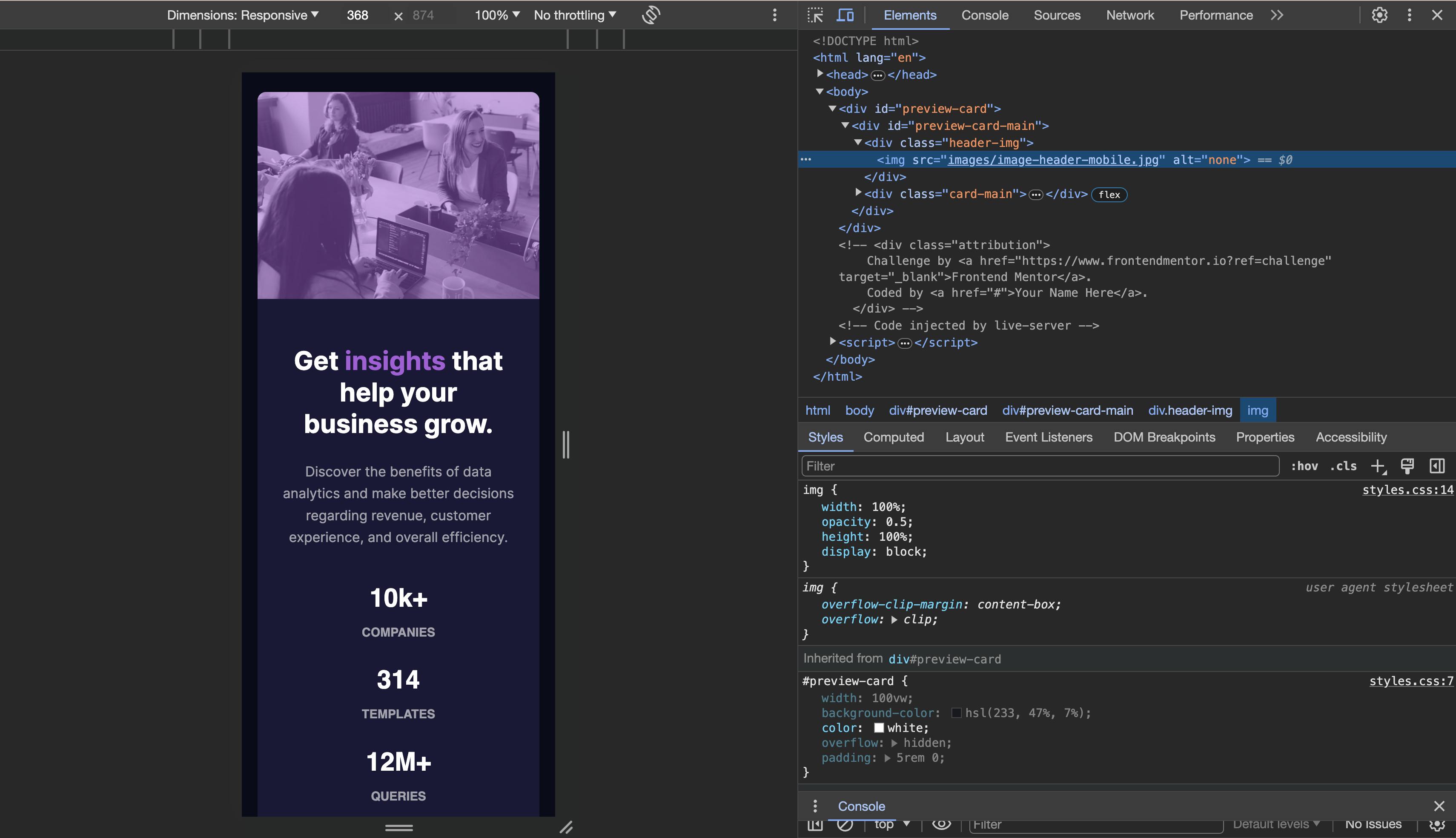
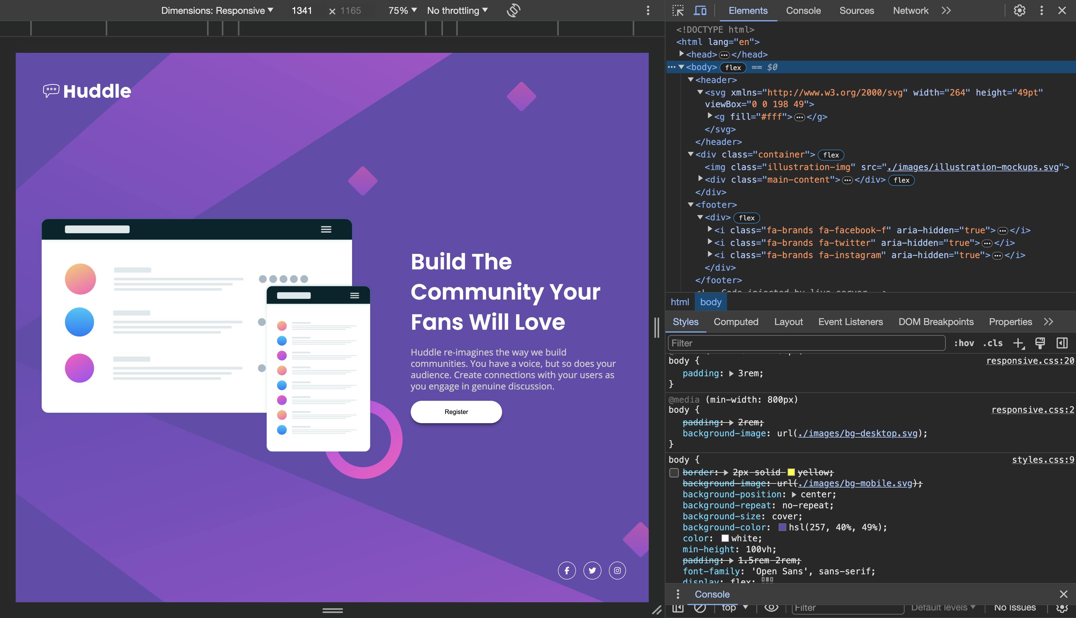
Use browser developer tools to simulate different screen sizes.
Inspect and debug styles for specific devices.
Real Devices:

- Test on actual devices to ensure accurate responsiveness.
By using media queries, you can create a more user-friendly experience for visitors accessing your website on various devices, from small smartphones to large desktop monitors. Always test your designs across different devices to ensure a seamless user experience.
Transitions and Animations
CSS transitions and animations add interactivity and engagement to web pages by allowing smooth transitions between different states or by creating captivating animations. Here's a guide on how to use CSS transitions and animations:
CSS Transitions:
Transitions provide a way to smoothly change property values over a specified duration. They are commonly used for hover effects, menu transitions, and more.
Basic Transition Example:
/* Apply a transition to the color property over 0.3 seconds */
button {
    background-color: #3498db;
    transition: background-color 0.3s ease;
}

/* Change background color on hover */
button:hover {
    background-color: #2ecc71;
}
Transition Properties:
transition-property: Specifies the CSS property to transition.transition-duration: Sets the duration of the transition.transition-timing-function: Defines the acceleration curve of the transition.transition-delay: Adds a delay before the transition starts.
CSS Animations:
Animations provide more control over the timing and sequence of multiple transitions. They are suitable for more complex and dynamic effects.
Basic Animation Example:
/* Define a simple animation called "bounce" */
@keyframes bounce {
    0%, 20%, 50%, 80%, 100% {
        transform: translateY(0); /* Initial and final state */
    }
    40% {
        transform: translateY(-20px); /* Bounce up */
    }
    60% {
        transform: translateY(-10px); /* Bounce down */
    }
}

/* Apply the "bounce" animation to an element */
.box {
    animation: bounce 1s infinite; /* Name, duration, iteration count */
}
Animation Properties:
@keyframes: Defines the sequence of styles for an animation.animation-name: Specifies the name of the animation.animation-duration: Sets the duration of the animation.animation-timing-function: Defines the acceleration curve of the animation.animation-iteration-count: Sets the number of times the animation should repeat.animation-delay: Adds a delay before the animation starts.
Combining Transitions and Animations:
/* Apply a transition to the color property and an animation to rotate */
.element {
    background-color: #3498db;
    transition: background-color 0.3s ease;
    animation: rotate 2s infinite;
}

@keyframes rotate {
    0%{
        transform: rotate(0deg);
        }
    100% {
        transform: rotate(360deg);
    }
}

/* Change background color on hover */
.element:hover {
    background-color: #2ecc71;
}
Testing and Debugging:
- Use browser developer tools to inspect and debug transitions and animations.

- Pay attention to timing functions to control the acceleration/deceleration.
By incorporating CSS transitions and animations, you can enhance the user experience and create visually appealing and interactive elements on your web pages. Experiment with different properties, durations, and timing functions to achieve the desired effects.
Conclusion
Congratulations! You've unlocked the potential of CSS and learned how to style your web pages. Practice these techniques on your own projects, experiment with different styles, and get ready for the next chapter in our web development series.
Resources and Further Learning
Call to Action
Excited about styling web pages? Share your thoughts and any styling challenges you've faced in the comments below. Stay tuned for our next adventure where we'll explore the world of JavaScript and dynamic interactions!